import pandas as pd
url = "https://raw.githubusercontent.com/pic16b-ucla/24W/main/datasets/palmer_penguins.csv"
penguins = pd.read_csv(url)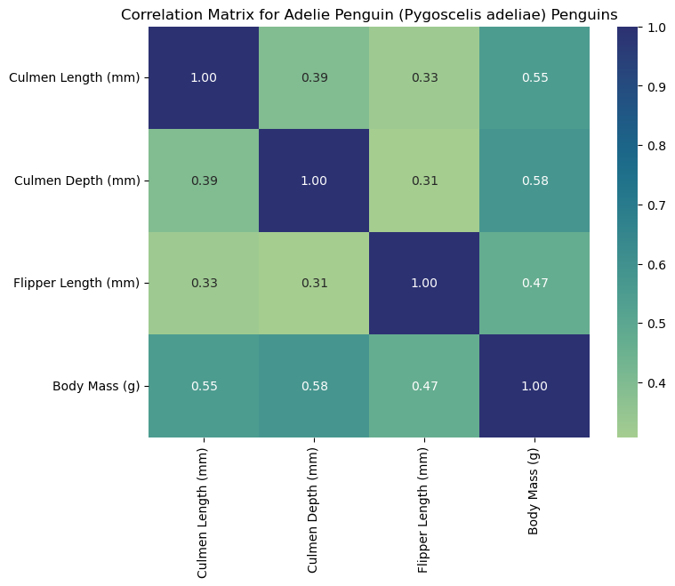
Introduction
The Palmer Penguins dataset contains measurements of penguin species from the Palmer Archipelago in Antarctica, including numeric measurements like culmen(bill) length, flipper length, and body mass. In this blog, we will learn how to construct a heatmap to explore correlations between these numerical features across the three penguin species: Adelie, Chinstrap, and Gentoo.
Read in and Inspect the Data
We will begin by reading the data into Python by running:
The first line imports the Pandas package into our project. We will use it to read the CSV file and manipulate/analyze data. After setting the variable “url” to our CSV URL, we can use the Pandas read CSV function to store the data frame as “penguins.”
Next, we will inspect the data by running:
penguins.head()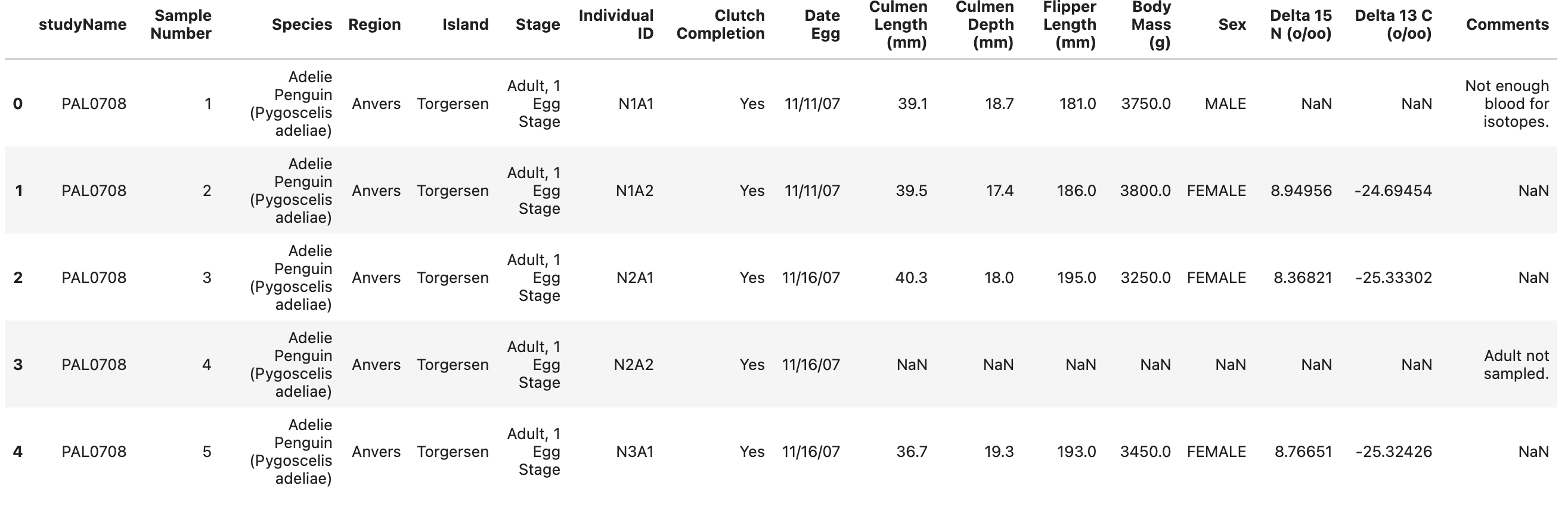
Cleaning Our Data
Analyzing the first five rows of the data reveals the columns we need to focus on. Since we want to find correlations between culmen length, depth, flipper length, and body mass for each species, we must manipulate the data frame to include only the relevant columns. We can achieve this using the iloc function.
We can create a new data frame with our selected columns by running the following code:
# iloc selects columns from penguins data frame using column index positions
# ':' selects all rows from the DataFrame
#  '[2, 9, 10, 11, 12]' selects the columns at index positions 2, 9, 10, 11, and 12
penguin_data = penguins.iloc[:,[2,9,10,11,12]]
The output will return a data frame, asigned to “penguin_data,” with only our desired columns. However, we still need to clean the data. Some rows in our data frame are missing inputs indicated by “NaN.” We can remove those rows with the “dropna” function.
Running the following code will remove all rows with missing data:
# removes rows with missing values "NaN"
penguin_data = penguin_data.dropna()
We can again check what our data looks like now by running:
penguin_data.head()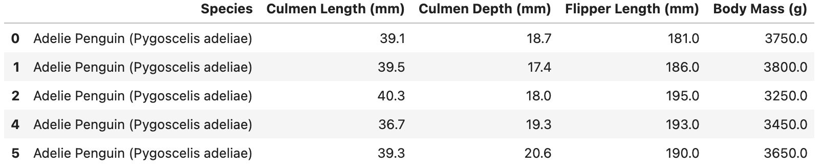
With this, our data looks ready to be used.
Create Correlation Heat Maps by Species
First, we must import the relevant packages for our correlation heat maps:
import seaborn as sns # Used for plotting the heat map visualization
import matplotlib.pyplot as plt # Used to for annotating visualization and giving specs
Since we want to create heat maps for each penguin species, we must write a function that 1.) groups the data by species, 2.) calculates the correlation matrix for each group, and 3.) plots the matrices of each group.
Let’s name the function: “palmer_penguin_heatmap,” which takes in our data frame, a key that will group our data by (in our case, “Species”), and a list of columns that we would like to include in the correlation.
Running the following code will establish our function:
def palmer_penguin_heatmap(dataset, key, cols):
    """
    Calculates the correlation matrices for each species and plots the heatmap.

    Params:
    -> dataset (pandas df): The dataset (penguin_data).
    -> key (str): Column that will group data by ("Species").
    -> cols (list): List of columns for correlation analysis.
    """
    grouped = dataset.groupby(key) # groups data set by species

    for species, group in grouped:
        corr_matrix = group[cols].corr()  # Calculate correlation matrix
        plt.figure(figsize=(8, 6))  # Create a new figure
        sns.heatmap(corr_matrix, annot=True, cmap='crest', fmt=".2f")  # Plots heatmap
        plt.title(f"Correlation Matrix for {species} Penguins")  # Add title for given species
        plt.show()  # Display the heatmap
After running our function, we are almost ready to call the function with our parameters. We have our data set and key right now, but we must define which columns we want to use for the correlation analysis.
We can do this by running:
# Stores a list of column names that we wish to analyze
num_cols = ['Culmen Length (mm)', 'Culmen Depth (mm)', 'Flipper Length (mm)', 'Body Mass (g)']
We are ready to call our function “palmer_penguin_heatmap” with our three parameters. We should expect our output to be three heat maps for Adelie, Chinstrap, and Gentoo.
We can call our function by running:
# Calls the function with our penguin data, groupby key, and target columns
palmer_penguin_heatmap(dataset = penguin_data, key = 'Species', cols = num_col)
Our outputs should look as follows:
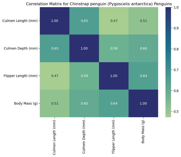
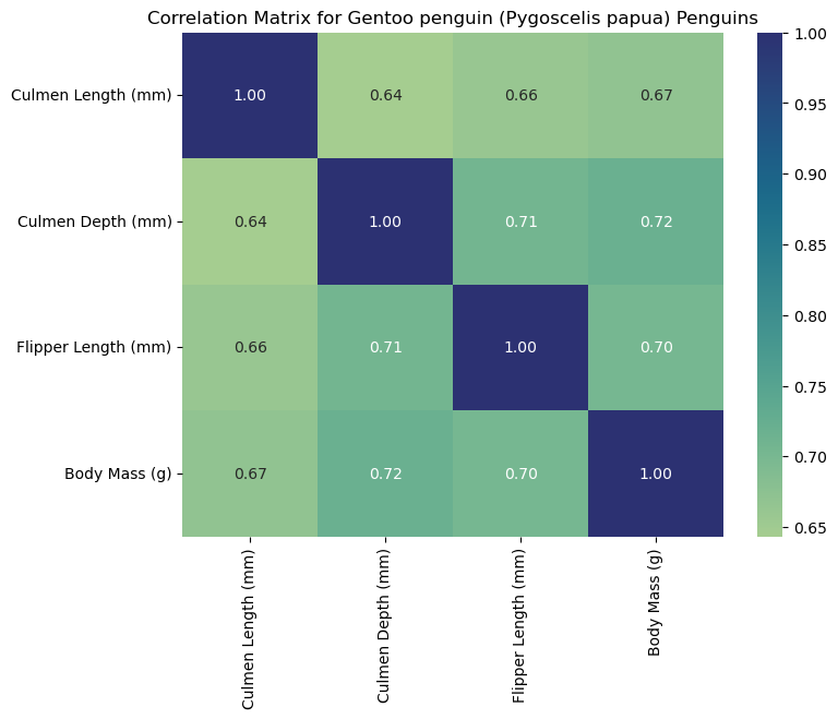
Interpreting the Heat Maps
Each heat map is titled with the corresponding species and labeled with measurements to help us interpret the data. Heat maps visualize correlation matrices. The color-coded squares help the viewer interpret higher correlations (denoted by the color bar on the right of the heat map). Thus, each square corresponds to the correlation of two select columns (measurements). As seen by the dark squares, any measurement compared to itself correlates to 1.00. These squares help us see where specific measurements may be associated with others. For example, we can claim that flipper length corresponds to higher body masses for Gentoo penguins since we observe a strong positive correlation (0.72). For this reason, heat maps are a useful first visualization for large data sets to spot patterns that can be further explored.